Have you ever opened a website and said, “ahh, my eyes!!!” Now think about what made it so?
- Hectic navigation
- Weird backgrounds
- No (or very minimal) imagery?
- Awful font choices
- Limited, if any, consideration to branding…
These are all aspects of what NOT to do when creating a website. Granted there are more, and I will endeavour to highlight as many as possible here.
It’s what social media pages, directories, referrals pages, etc. all link back to. The issue is, if a website visitor gets linked to your website from one of these avenues, and they see any (if not all) of the above DON’Ts list…they are going to bounce and do so very quickly.
So, why would they stay?
Or a better question to ask might be, what would entice them to stay?
Pretty much the opposite of the DON’Ts list, but to ensure I just don’t highlight them, I am going to break them down and add a few more pointers. Plus, I’ll add in a few handy hints about what metrics they pair up with on an analytics platform (for more info about analytics platforms, read my other blog! And to know what a metric is and why is it important, read yet another one of my blogs!)
1. Navigation
A website’s navigation needs to orient and direct visitors, but it also contributes positively to your SEO (search engine optimisation). Due to this, it is incredibly important to keep it clear and concise.
Take the WorkingMouse website as an example. We pride ourselves in drilling down on information about the industry and our projects but want to provide the ability for our website visitors (a substantial number of these are our customers) learn alongside us.
Therefore, we changed up our navigation title slightly here to showcase our knowledge spreading brand and that are experts in our field.
The navigation heading “Learn” orients our visitors with directing them to our knowledge centre of the website. Additionally, Google, and other search engines, recognise this is our area for knowledgeable content, and it can direct searchers here too.
Also, for Google’s sake, a well organised website is deemed a quality website. So, if your navigation is directive and organised, Google will reward you for this.
Question: How can I validate the quality of my website’s navigation through analytics?
Answer: Heat maps! These are a great representation of data which depicts how visitors are moving over the website and what they click on. Use the “move” option here. If you see a lot of movement across the navigation bar, then it’s most likely not providing the most direct information.
Top Tip: some analytics programs don’t have heat maps as an analytics option. In this case look at page views and their session times. If the page view is high and the session time is low, it is likely that the navigation isn’t as clear as it could be.
2. Backgrounds
I could lump backgrounds with imagery and branding, but as this is our website’s canvas, we want to set it up as a strong foundation.
I see bad backgrounds in 2 lights:
- Static – like something out of PowerPoint Windows XP background templates (remember the sand-like one?!?!)
- Overwhelming – this is not a time square people! Keep it clean!
Digging into this a bit further, a great website background should showcase the brand, not take more than 3 seconds to load (at an absolute maximum) and differentiate areas of content throughout.
The metric I would use here to validate a great background would be bounce rate.
There are a heap of different blogs and case studies that will highlight which are the bounce rates to hit and which are the ones to be aware of. My recommendation, always look into an industry standards pages. SEM Rush keep their listing updated consistently.
The construction of the background will be fleshed out more with branding and imagery (scroll down, they’re coming up next!).
3. Imagery
A picture is worth a thousand words. What a cliché! But seriously…
If your website’s imagery is on point, it should be to tell a story! Just for clarification, when I say story, I don’t mean a storyboard of images that walk through your company’s life story #aintanybodygottimeforthat!
Select images that are hero images. These are the images that depict your brand perfectly in 2 dimensions. They speak volumes to what your company does, the people who work there and start to set the precedent of the quality of work produced.
Images do not always have to be photos; they can be graphics, videos, gifs, etc. If I continue using the WorkingMouse website example, as soon as you click on to it, you see a reel of bite sized videos on a loop.
Each video depicts aspects of our organisation’s brand; the people, the process and the technology. This is a great way to engage website audiences and showcase a lot of information in a clean manner.
Going back to that bounce rate metric – an engaged website visitor is not going to jump out of the website instantly so that bounce rate stays nice and low (well low with respects of industry standard).
Remember when I mentioned the heat map metric earlier? Heat mapping [should] have a “scroll” option. This means you should be able to see the concentration of visitors who scroll through each of your webpages. This is a great way to measure engagement for each page.
If you have access to both metrics, use them in a tandem approach! The more robust the data sets, and the better observations you can make therefore the more strategic you can be about your next steps.
4. Branding (don’t worry, I haven’t forgotten fonts – it’s just better placed here!)
I watched a video the other day that reminded me that defining branding is actually quite difficult. In my experience, I generally say, branding is anything produced by the company that is memorable.
When I think about memorable elements of brands, I think of colours, shapes, slogans and the emotions those elements evoke.
Now – translate that to your website.
Your website is a flagship opportunity for you to showcase your brand. Unlike social media platforms, where you are working within the confides of their content posting structures, your website is just that, yours! So, make it just so!

When I think of the Apple brand, I think of simple yet sophisticated designs and products that work seamlessly together within their own eco-system.
So, having a look at their website, I should find this on each and every page (it’s really important to stress that a website should have the same branding all the way through). And that's exactly what I find!
Honestly, I could go into a lot more detail about branding, but I suggest having a read of our Guide to a Successful Website – we have gone into A LOT more detail about it.
5. The Non-Visual Elements
If you had a chance to have a gander at our Successful Website Guide you will notice a lot goes into the building blocks of a website that it not necessarily visual.
To be honest, from a website visitor’s point of view, the visual stuff is going to mean a lot more to them, but it’s going to mean nothing if they can’t find you in the first place.
We live in a world ruled by a search bar and a verb, “google it.” Because of this, we need to make sure that our digital presence fits in with this.
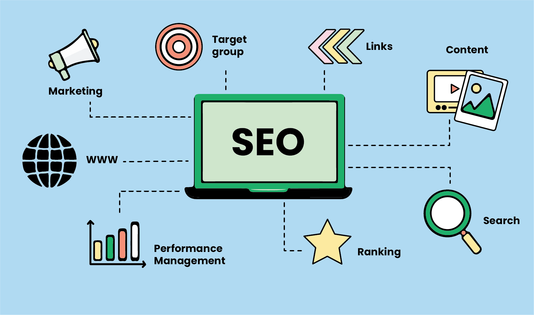
Earlier I mentioned the term, SEO. Simply put, this is the process whereby we continuously iterate on the website to make it more favourable to search engines.
More favourable means that the search engine will rank your website over and above other websites. As you might be aware, when a search request is submitted to the search engine, it scours the world wide web to present the researcher with options that are pertinent to their search. If you can answer the request, you want your website to be front and centre to the researcher.
The iteration process of working towards great SEO can seem relentless but it is so worth the effort in the end.
So, why am I harping on about SEO as the last element in this article for a great website?
Great SEO, or ranking, comes from content, backlinks, navigation (what we explored before), and so much more. For the purpose of this article, I am going to focus on content.
Content is king!
Another cliché – what?!?!? But in all seriousness, content is the way to keep current, show expertise and ensure website visitors that you still exist!!!
Why do we want to stay current? In publishing new content, or updating existing, search engines recognise this, and they LOVE it. Updated content means better domain authority. This is pretty much the power your domain has (i.e. the your branded URL slug) to influence the ranking. Think domain authority is like domain expertise.
Why do we search things? Because we don’t know! And we put a LOT of trust in search engines to produce results that actually answer questions. Or, more importantly, demonstrate that there is an expert out there.
Website content, albeit videos, graphics, or written text, contribute to those “answers” we are also seeking to find. It is really important that when using non-verbal content, they are indexed and referenced correctly.
SEO is a sporadic ranking system to say the least…so it’s best to keep up to date with SEO practices. I like to use the word sporadic because it every year (if not more) the rules change.
But, whyyyyy?!?
Who knows, but there are very well-informed people out there that keep everyone else updated. My advice, follow Google on Twitter and then refer to a “best practices” guide, like this one published in May this year.
I have highlighted a few different metrics throughout this article that are [usually] included in analytics platforms, but when it comes to SEO, it’s a combination of many (if not all).
Due to this, to validate your SEO, and stay on top of it, use a ranking analysis platform such as SEMRush. There are many of these platforms out there, similar to general analytics platforms. To choose the best for you, think about your company size, the size of you website and what the intent your website is there to do.
It’s very interesting how something, seemingly static, such as a website, can be so complex and fluid. Needless to say, websites are not set and forget pieces of digital content, they need to be reviewed, analysed and iterated upon.
If you are thinking to yourself, “gosh, I don’t even know where to start with my website now.” Hit us up for a consult!