User Interface design, or UI design, is a fairly recent term for one of the oldest design practices. At its core, UI design is about the structure and aesthetic of a website or software. It differs from the layout design one might encounter in a publication by virtue of being interactive. For example, when you read a magazine, information is presented to you as the pages are turned, but there isn't much more you can do with the magazine aside from read it or put it down.
User Interface Basics
When you visit a website you have choices about what buttons to click, what videos to watch and in what order you perform those tasks. As such, good UI design is not just about looking great, it's also about carefully arranging elements so that users can fully experience the website or software in the way the product owner intends. This also brings up the additional point that UI design is often confused for User Experience, or UX design. While there is significant overlap between the two disciplines, ultimately UI design is focused on the visual craft of design in a technological context, whereas UX design focuses on the overall experience a user has on a particular platform. Generally, the goal of a UX designer will be to ensure the software gets a user from Point A to Point B with minimal frustration, so that users not only enjoy being on the platform but are likely to return and even become advocates of that software.
Therefore, UI design is a critical piece of the puzzle towards ensuring a dedicated and ongoing user-base for your website or software application.
The Good
Let's start with Apple's website. This is a great example of what is called minimalist design, and shows how effective it can be when it comes to showing your product.
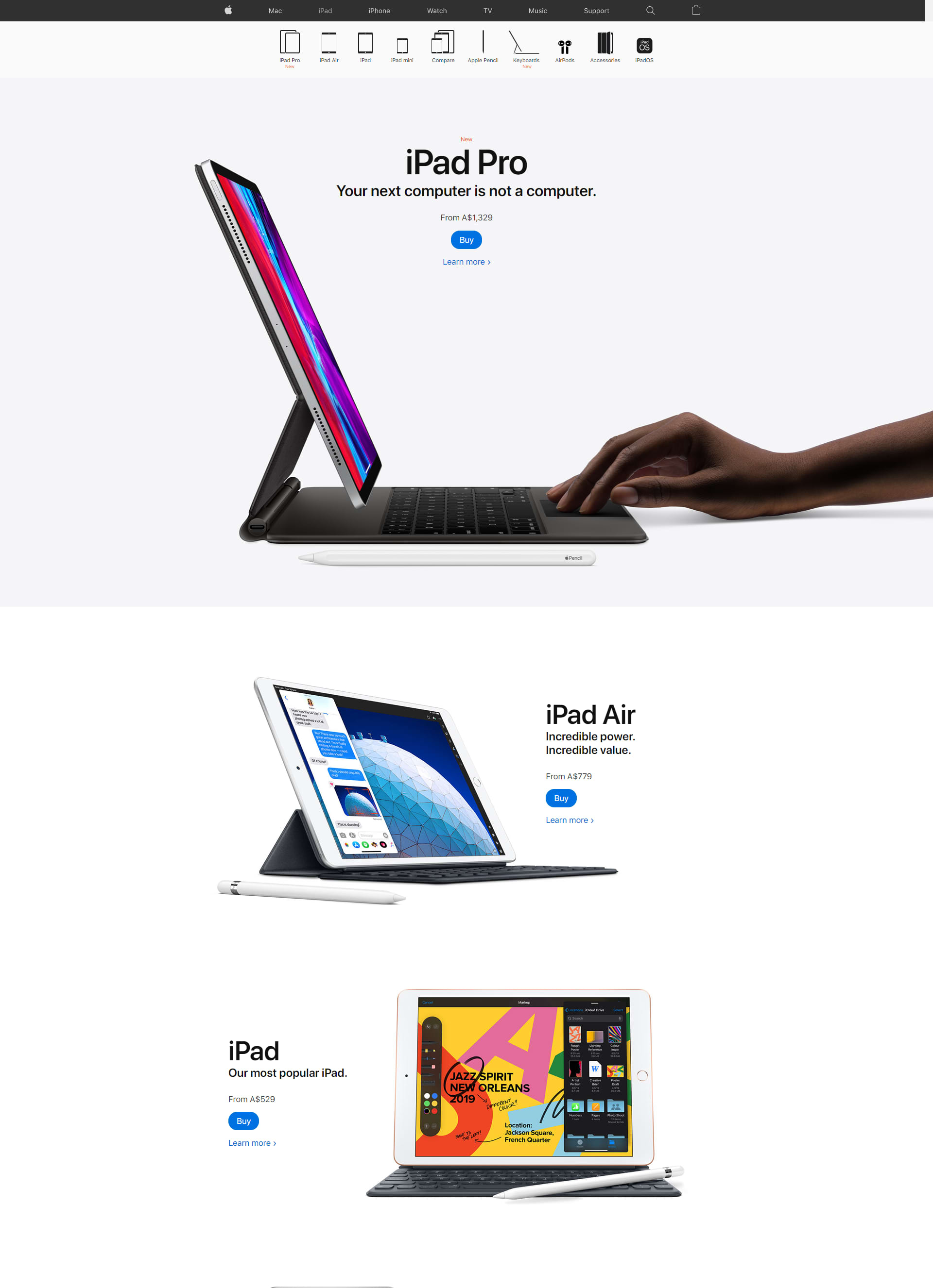
Similar to what you might find in a modern art gallery, the space surrounding each artwork or content block is surrounded by generous amounts of negative, or empty space. This breathing room naturally makes users focus on the content without distraction, and is a simple way to create sophistication in any design. The fonts are tightly controlled and display a hierarchy of information. Although there is colour and vibrancy in the design, this is due to the product photos or illustrations and not due to any use of decoration in the underlying structure.
On the other side of the coin, we have Vanity Fair's current website, which beautifully illustrates the merits of maximalist design.
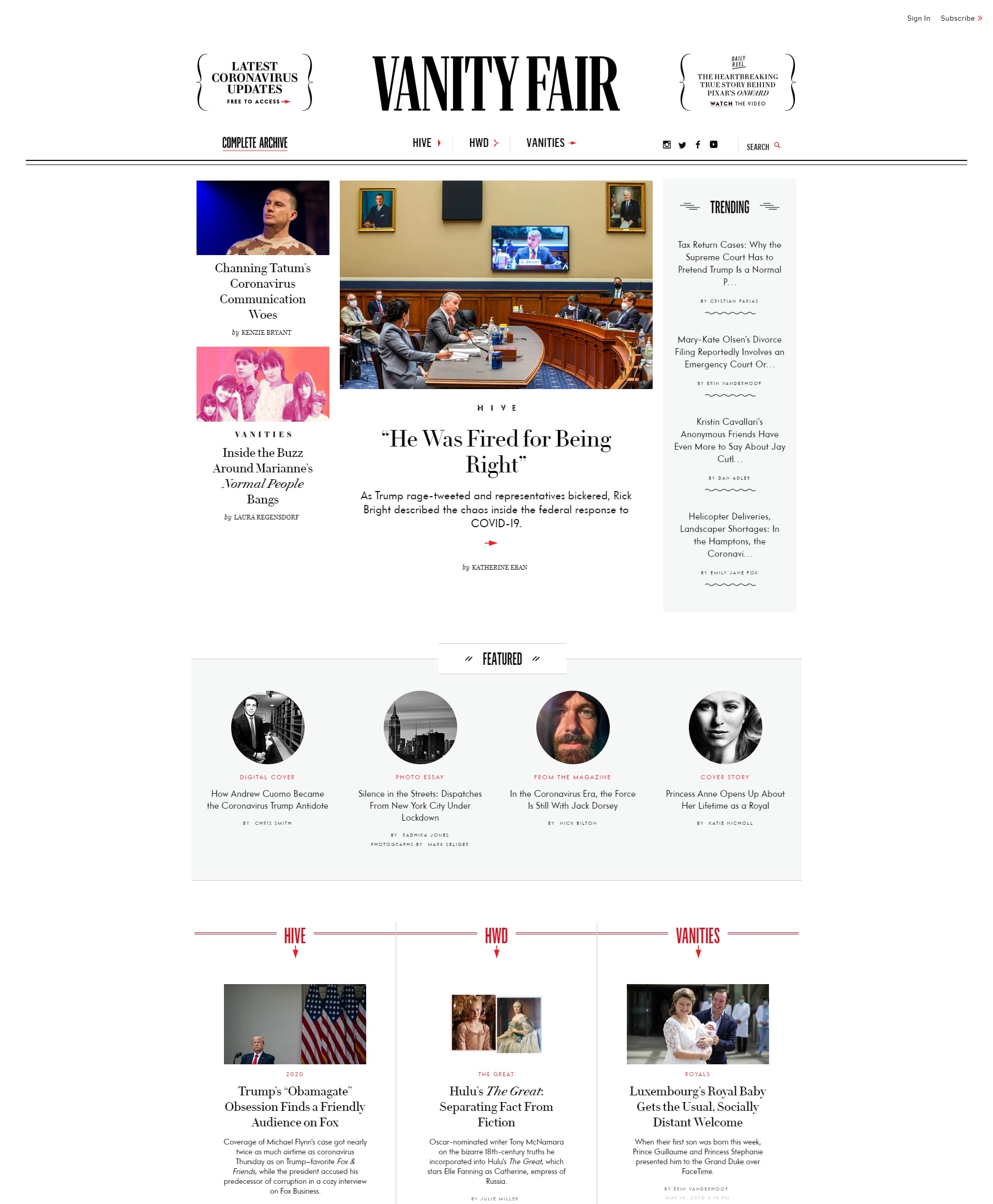
The look and feel of a newspaper has been translated to a digital format, with the use of different, but complementary fonts, and decorative elements such as swirls and arrows. Even though there are a lot of things to look at in this design, it is not at all busy or distracting. This is because the designers have utilised a grid system to structure out this page such that your eye moves smoothly across the content as you scroll. This is exactly the same technique which graphic designers apply to publication design.
The Bad
Everyday there are new designs to be inspired by, but unfortunately, there are also plenty of products which are suffering from poor design choices. Remembering that UI design is all about supporting the function of an application, these clunky aesthetics can seriously hurt the way a product is used and perceived. In some cases, particularly for websites providing essential or government services, this can have legal ramifications. For example, there exist today plenty of regulations which mandate wheelchair access at municipal buildings. In similar fashion, the Web Content Accessibility Guidelines, or WCAG, are an international standard which help designers ensure that the products they create are more available to people with disabilities.
Poor UI design is often not only visually unappealing but creates impediment to the use of that product. In many countries, legal frameworks exist to enforce accessibility guidelines on software which is public-facing. To avoid the stress and costs of re-designing an application to fit with WCAG, the simple answer is to prioritise thoughtful and accessible UI design from the very beginning of that application's lifecycle.
If you want to learn more about setting your product up for success throughout your application's lifestyle, download our Guide to Creating a Successful Software Product below.

Do's
- Choose an aesthetic which matches your brand and the messaging you want to convey.
- Be bold and brave in your design choices.
- Pick quality over quantity every time. One professional photograph is better than ten stock images.
- Use a grid-system to create an underlying structure for your layouts.
- Ensure that your product is accessible and complies with the WCAG.
Don'ts
- Put content on a page just to 'fill the space.'
- Use low-contrast or inaccessible colour combinations for your text.
- Only use images to convey information unless there is an alternative way to view that information.
- Use flashing imagery, colours or other media which could cause seizures.
- 'Eyeball' a layout instead of using grids.
- De-prioritise UI design during the creation of an application or website - it is essential to the success of that product.
Good UI design isn't rocket science. It really comes down to giving the users what they want, which is generally an easy to use, streamlined application/website. The basic principles mentioned in this article are good ways to satisfy your end users. A UX designer can help implement these practices and ensure your user interface doesn't lead to any of these moments.
We also aim to avoid any of those moments when creating your software product. Contact us here for further discussion.