Moreton Island Adventures 2.
Services
UX/UI design
Web application development
Migration
Technology
C#Bot
Brief
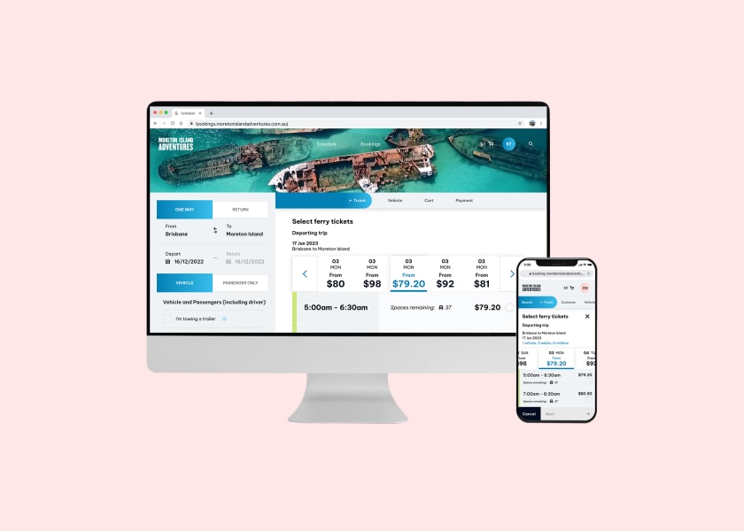
Moreton Island Adventures offers an online booking system for travellers to book with the MICAT (ferry service). This project aims to
modernise and improve the mobile experience of the existing booking platform while creating a white-labeled version for other ferry
operators in the industry to license.
PROBLEM STATEMENT
"How might we create a global ferry booking experience optimised for
customers on any device, to become an attractive ticketing solution
for ferry operators across Australia?"
Let's take a deep dive
Understanding the problem
By leveraging the concept of white labeling, Liz wishes to create an application, unique to the industry, that can be customised and
rebranded for various clients.
Ideation & research
By analysing the success and functionality of MIA, we can extract valuable insights and observations that can be applied to the white labelled service. These learnings will serve as a foundation for enhancing the performance and overall user experience of the white labelled offering for MIA. Over the past 6 months, we observed a significant growth in mobile device users, rising from 55% to 62%. However, this was paired with findings of a considerable drop-off rate in conversions for mobile users. During scope, a mobile-first approach to design needed to be taken to ensure the mobile booking experience remained usable and seamless, matching the quality of the web version. Another finding indicated that users desired the ability to browse the ferry schedule before committing to ticket purchases. Introducing this intermediary step effectively grants users additional time to evaluate their options and select preferred dates right from the start. Given this application would be white-labelled, it was crucial to maintain the operators' brand identity on the modernisation of MIA and ensure the booking portal reflects their look and feel.


After 4 weeks of Discovery, 9 months in development, 524 feature tickets...
The solution
The new system will ultimately act as a replacement for the existing MIA platform. The transition lies in elevating the mobile experience, improving the booking flow and enabling self-servicing capabilities. As a white-labelled system, operators will have the ability to customise the booking system to cater to their unique business requirements. To achieve this, the platform needed to provide businesses with a user-friendly interface, allowing them to customise their logo, brand colours, and feature images without requiring the involvement of a development team. This streamlined process empowers operators to align the booking portal with their own branding, creating a consistent and professional user experience.


