Please note that this blog is archived and outdated. For the most current information click here!
Why You Should Use UX Flows and Prototypes When Starting App Development
Project managers often have an idea of how they want the application to look but may not have the creative skills to present a visual explanation of the processes and functionality of the app. Something is needed to translate their abstract idea into something tangible that the designers and developers can use. This is where a UX flow and prototype come into play.
UX Flow
A UX flow uses wireframes to map out the user's experience while they're using the software. These wireframes allow the designer to plan the layout and interaction of an interface in low fidelity or high fidelity (low-fi or hi-fi). A low-fi wireframe won't go into minute detail like the typeface choices. Instead they act as a starting point for a designer to work on the layout. They also give the project manager an idea of the room available for content on each page. The image below is an example of a low fidelity wireframe. It shows how the user can navigate around the application and the general layout of each screen.
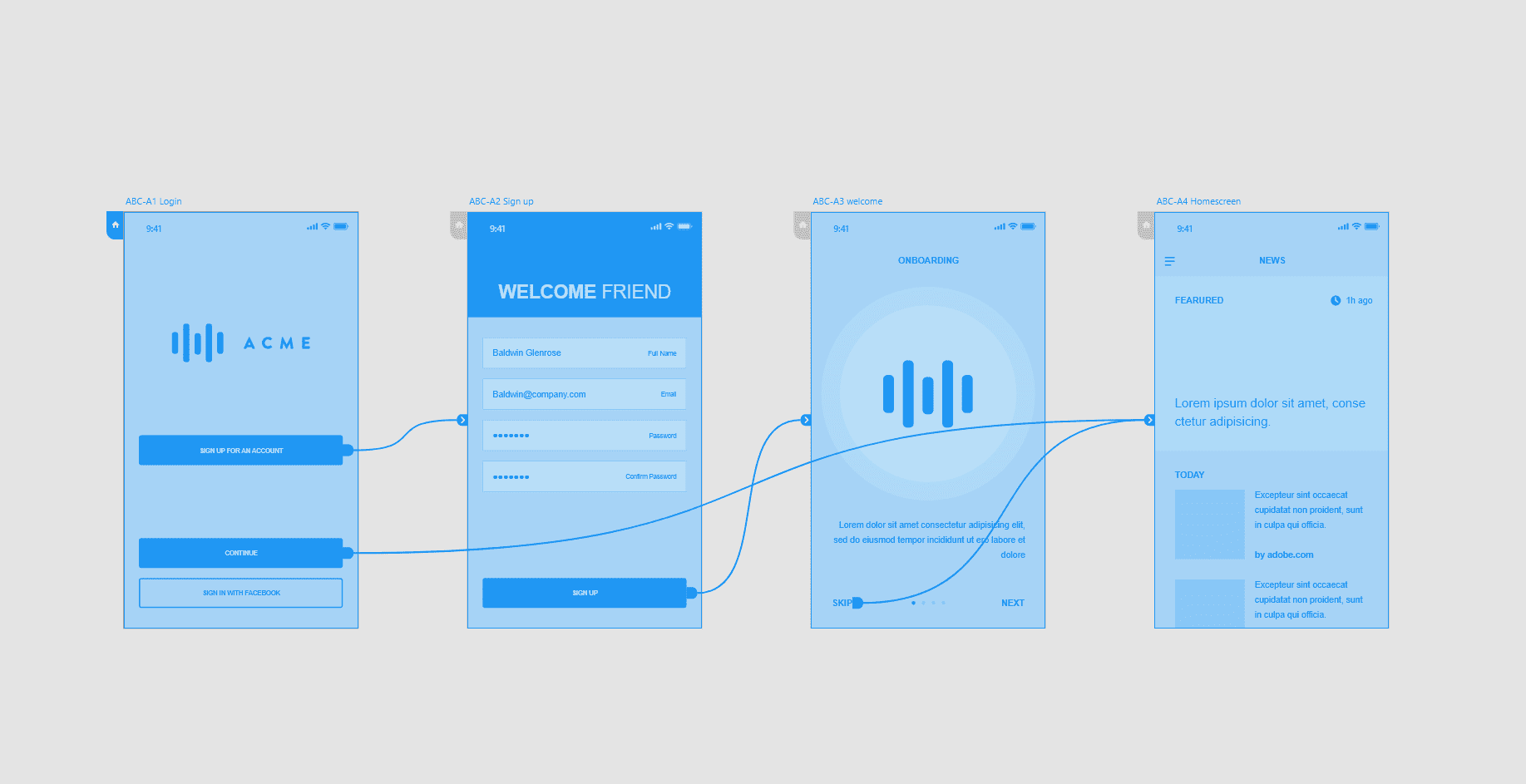
A high-fi mockup is a more detailed version of the UX flow. It has realistic content, specific typeface choices, image dimensions and particular button styles. They are used only to expand out certain low-fi screens that may require more detail.
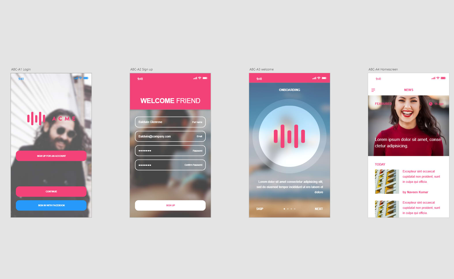
At WorkingMouse, part of our scoping process is to provide low-fi wireframes, as well as a prototype of the application for customers.
Prototyping
After the UX flow is completed, the next logical step is to create a prototype. Now keep in mind a prototype is very different to an MVP (minimum viable product). Generally there's no functionality when you're prototyping. For example, you may have a dashboard that displays a still image of what data you might expect to see in your finished product, but not the actual data. This step in the scoping process is a way of demonstrating how the site will look and feel. By creating some basic interactions, users are able to click through screens. This gives the project manager an idea of what button does what.
However, a prototype could also be a piece of functioning software that proves the idea is feasible. For example, at a hackathon the focus is on creating a semi-functional prototype in a limited amount of time (not a polished final product).
My weapon of choice when creating these is InVision. It's a very simple tool that allows you to position your images and text on a screen. You can then create multiple related pages and click through to test.

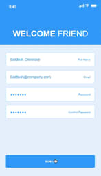
For example in the image above, once you click on 'Continue' on the first page, you're then taken to the second page where you can fill in your details.
A key advantage of prototypes is that its polished appearance speaks for the time devoted to it and provides a clear idea as to how the interface will look and work.
We believe it's important to partner with our customers, translating their idea into a functioning application. However, when it comes to improving the user experience, it's important to consult UX designers. That's where software development becomes a collaborative process, with each stakeholder bringing different skills/attributes to the table. While it's better to leave the designers create the prototypes, it is important to understand the process.


